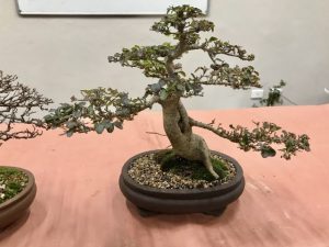
How does one deal with helping students style trees over time? With one’s own trees there is an ongoing plan (hopefully!) and relationship but how does a bonsai teacher keep a tree moving forward that he/she may only see once a term or even once a year? Leong Chong’s solution is what he calls the ‘Seven Principles of Bonsai’. These allow him to bring the same parameters of design to a tree no matter what stage its development.
Principle 1: Start at the Bottom. Find the nebari and choose the style of tree that suits the nebari you have. If there is no nebari, put the tree in the ground and wait. Bonsai is about patience! A tree should engage the viewer in a visual cycle so the nebari must complement the tree’s style or it is visually confusing.
Principle 2: Visual Dynamic. Find the trunk, taper and movement which create the visual dynamic. Look for a trunk line and if it is not good enough, cut the trunk early and create movement. Cut and grow and then cut and grow again allowing the tree to get tall so the trunk thickens up. When the trunk is two thirds of the desired thickness, the tree is cut back to a third of its desired height.

Field grown trees naturally have taper, but in bonsai the taper has to be sharp and exaggerated and cutting the trunk for movement also achieves this taper. However, the style of the tree must suit its nebari so it does not confuse the eye. For example, an informal upright’s apex
should be above the nebari, a slanting style should not have a symmetrical nebari while a cascade’s nebari is a bit loose and has some roots exposed.
Principle 3: Visual Balance. A bonsai needs balance but it doesn’t need to be symmetrical (exception broom style). Asymmetry is much more interesting to the eye. To achieve this and create interest:
- ● vary the branch size and amount of foliage
- ● vary the spacing of branches incrementally reducing the distance between branches as you move up the tree
- ● create visual interest with sharis or jins
Visual balance is proportional balance. The rule of thumb is the height of a tree is 6-12 times its girth, e.g. if the diameter of the trunk is 5cm then the tree can be 30-60cm tall but a tree can be squatter and more dynamic. Leaf size should be in proportion to the tree. If the visual balance is too predictable the viewer will not be engaged. In a ‘far view’ the tree’s structure, which provides interest, is not shown so missing elements must be included in the design whereas a ‘near view’ must have lots of negative space (space between the branches) to provide relief for the eye. The viewer can see through and therefore see the character of the tree.
Principle 4: The Golden Ratio. https://www.livescience.com/37704-phi-golden-ratio.html
To shape the profile of a tree Leong uses the golden ratio seen throughout nature (in the number of petals a flower has, seed heads, pine cones, shells etc) which creates the golden spiral. By using this proportional relationship of 1:1.6, Leong creates a less sharp design and a tree more representative of an older tree in nature.
Principle 5: Branches. Create branches that have movement. The first branch should be about one third of the height of the tree that is, the beginning of the canopy.
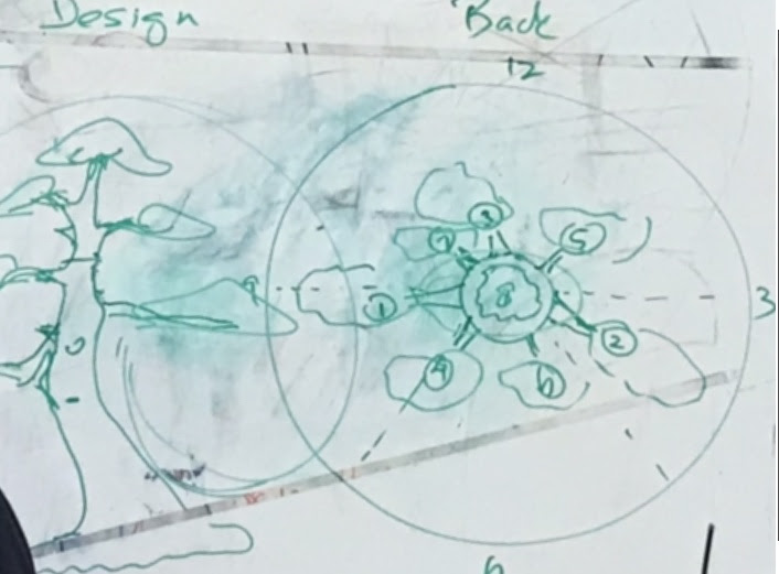
To place branches, Leong uses a clock face as visual prompt; 12 o’clock is the back of the tree and 6 o’clock the front of the trunk. The first branch should be towards 8.30 and coming slightly towards the viewer and similarly the second branch should be around 2.30. The first and second branches should never be diagonally opposite when the tree is viewed from above. The third branch is at the back but never at 12 o’clock. Place it a little on either side of twelve (11.30 is better than 12.30) so all the branches can be seen. (Obviously these are interchangeable however the back branch can never be the first branch.) Develop branches on opposite sides but avoid symmetry. The forth branch could be at 2 but 7 is better and so on.

Finally make the foliage pads well spaced around the tree but randomly as this allows the sun to reach all the branches and ensure their health.
Principle 6: Foliage. Foliage is best grown on branchlets. Work on ramification to develop these. Move branches/branchlets into position if necessary.
Principle 7: Tell a Story. Aesthetic decisions need to be made here. Choose a pot that complements your tree not compete with it. Only add a jin or shari if it adds value.
